 |
| Real Polce Box |
Hartnell TARDIS |
Tom Baker Prop |
John Nathan-Turner Era |
Paul McGann prop |
Russell T Davies Era |
|
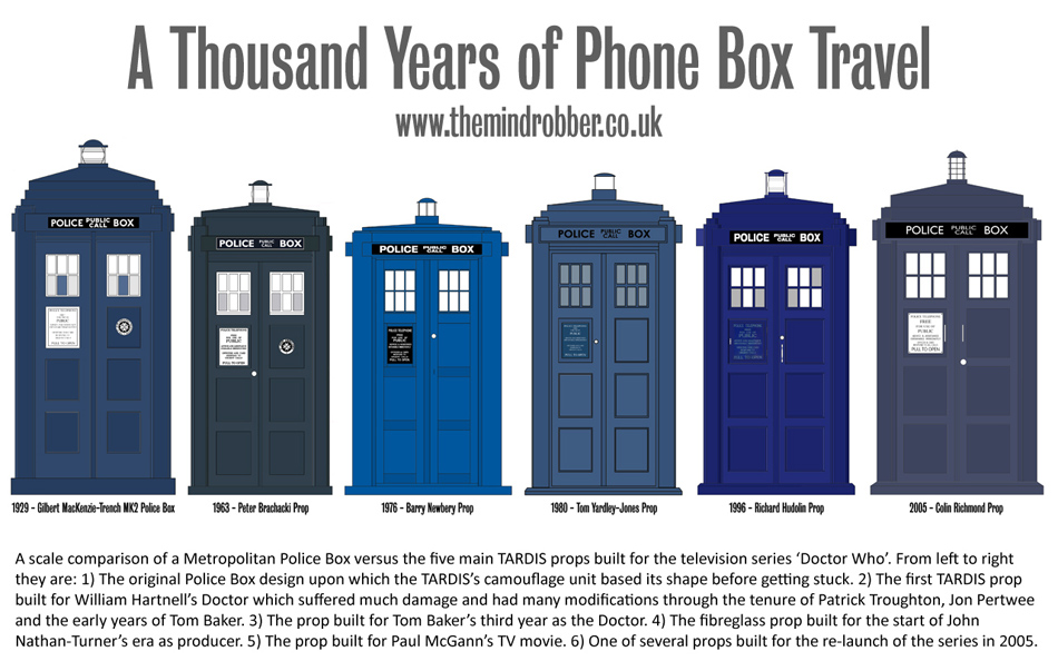
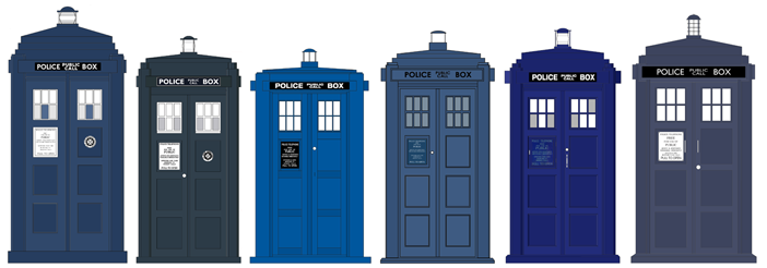
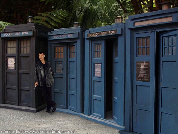
Not everyone realises that the TARDIS in Doctor Who has changed many times, and those that do many not realise quite how much it changed. Then again, maybe the differences are only visible to those amongst us who don't get out enough - Those whose lives are enlivened by doing diagrams such as the one above showing the main TARDIS props to scale.I am unhealthily delighted by creating such diagrams, and if seeing such a diagram delights you, then read on.
 Version 1 - Season One - Peter Brachacki Version 1 - Season One - Peter Brachacki
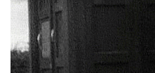
The designer responsible for the first Doctor Who serial was Peter Brachacki and as such the very first TARDIS shape is his "design". At a glance it is a reasonably faithful reproduction of those Police Boxes which could be seen on the streets of England in the sixties, but there are differences. Its roof stacks were not tall enough, and nor was its top 'pyramid' which resulted in the whole prop being a lot shorter than a real box. The panels had less margin around them and the overall box was narrower. It had a St John Ambulance logo on the door and a faithful arrangement of hammered glass window panes. One interesting thing to note is that the lock of the original TARDIS was on the left door, and there were no door handles.
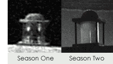 The prop remained relatively unchanged throughout the sixties, although in season two it's rounded glass lamp was replaced by a cylindrical plastic one with a large, pillared black cage. There was also quite a refurbishment for The War Machines, and inconsistencies can be seen between the location footage and the studio recording. The prop remained relatively unchanged throughout the sixties, although in season two it's rounded glass lamp was replaced by a cylindrical plastic one with a large, pillared black cage. There was also quite a refurbishment for The War Machines, and inconsistencies can be seen between the location footage and the studio recording.
 Another "version" of the ship worth mentioning was seen at the end of The Massacre during double-banking and a very ropey couple of sides were knocked up to go with a front panel (shown on the right). Another "version" of the ship worth mentioning was seen at the end of The Massacre during double-banking and a very ropey couple of sides were knocked up to go with a front panel (shown on the right).
 Version 1b Version 1b
Season Four - Peter Brachacki
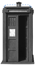
The final story of Season Three of Doctor Who saw a reconstruction of the roof of the Police Box. Although initially the TARDIS looked normal when it landed in London for The The War Machines, it changes a few seconds into the scene. This is because the shots on location were filmed before the significant refurbishment, but the remainder of the scene was recorded in studio after the work had been done.
The box had its original front and rear doors replaced with the white TARDIS cupboards from The Celestial Toymaker, and a repaint left all the windowframes black. The roof stack was reduced in height by about fifty percent (but the same lamp was retained).
The image on the left shows the revamped TARDIS with a dotted blue line showing how high it had previously been.  The prop was further modified around May 1967 when the doors were refitted, and the telephone sign panel was reattached on the wrong side. This unusual sight can be first seen in The Evil of the Daleks (on the right). This right-handed appearance lasted into the following season five (model shots in Tomb of the Cybermen not withstanding) and can be seen clearly in both The Enemy of the World and The Web of Fear. The final appearance of the phone panel on the right hand side was in episode one of The Wheel in Space. The prop was further modified around May 1967 when the doors were refitted, and the telephone sign panel was reattached on the wrong side. This unusual sight can be first seen in The Evil of the Daleks (on the right). This right-handed appearance lasted into the following season five (model shots in Tomb of the Cybermen not withstanding) and can be seen clearly in both The Enemy of the World and The Web of Fear. The final appearance of the phone panel on the right hand side was in episode one of The Wheel in Space.
 For the following season six, the prop was refurbished again and the wrongly-positioned phone sign was finally corrected in advance of filming of The Dominators in the last week of April 1968.
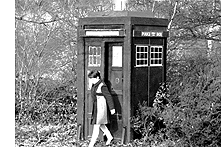
In The Invasion the TARDIS police box acquired two handles; one on the phone panel and one on the right door, and the key-hole switched over to the right door. Pictured right. For the following season six, the prop was refurbished again and the wrongly-positioned phone sign was finally corrected in advance of filming of The Dominators in the last week of April 1968.
In The Invasion the TARDIS police box acquired two handles; one on the phone panel and one on the right door, and the key-hole switched over to the right door. Pictured right.
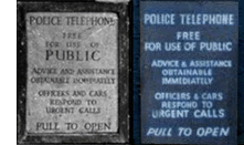 For the The Seeds of Death, the sign on the telephone compartment door changed considerably. The new version is different in layout, font, size and colour. The black-on-white became white-on-blue and the words "FOR USE OF PUBLIC" were all run together on one line. For the The Seeds of Death, the sign on the telephone compartment door changed considerably. The new version is different in layout, font, size and colour. The black-on-white became white-on-blue and the words "FOR USE OF PUBLIC" were all run together on one line. 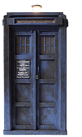 The word "and" was replaced in two places with an ampersand (&) which would be retained to the present day. The word "and" was replaced in two places with an ampersand (&) which would be retained to the present day.
This version of the prop continued on into the third Doctor's era (revealing its colour) and it looked ever more neglected throughout season eight. In season nine it got a repaint and it became vivid blue, whilst the plaque changed again from a blue background to a black one. 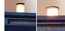 For Jon Pertwee's final season the TARDIS gained a new, simpler light which changed again slightly and the prop was refurbished and repainted for season thirteen (pictured left). This prop lasted in one form or another for an amazing thirteen years of production - which must only come second to a couple of the Dalek props for the record of continued use of an original TV prop. For Jon Pertwee's final season the TARDIS gained a new, simpler light which changed again slightly and the prop was refurbished and repainted for season thirteen (pictured left). This prop lasted in one form or another for an amazing thirteen years of production - which must only come second to a couple of the Dalek props for the record of continued use of an original TV prop.
Version 2 - Season Fourteen - Barry Newbery
Following the deterioration and ultimate alleged collapse of what remained of the original, a new prop was created by Barry Newbery for the start of season fourteen, and it featured from The Masque of Mandragora up to and including The Horns of Nimon.
This prop had the least in common with the old London Police Boxes, but the phone plaque at least regained its full frame and it also switched back to white text on a blue background whilst reverting to the original configuration of having the word "PUBLIC" appearing largest. One strange thing occurred however, as the letter 's' was dropped from the word "officers".
Aside from a couple of changes of the lamp 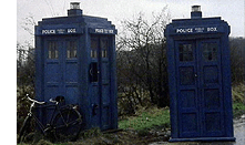 (including turning into an actual rotating Police car light in The Armageddon Factor) this prop remained in use for four of Tom Baker's middle years. However this Newbery prop made three guest appearances. For Logopolis it was fitted with a new built up roof (making it look considerable better) to portray a real police box (and the Master's TARDIS). Then it had its doors swapped for a fibreglass pair made from new moulds ahead of its appearances in Castrovalva and Black Orchid. (including turning into an actual rotating Police car light in The Armageddon Factor) this prop remained in use for four of Tom Baker's middle years. However this Newbery prop made three guest appearances. For Logopolis it was fitted with a new built up roof (making it look considerable better) to portray a real police box (and the Master's TARDIS). Then it had its doors swapped for a fibreglass pair made from new moulds ahead of its appearances in Castrovalva and Black Orchid.
It was during a refurbishment for the Castrovalva cameo, that the wording on the telephone plaque was changed which would have a knock-on effect in the 21st century. During the episode the TARDIS was only seen on its side and from a distance, but publicity photos of the new Doctor shows that where it used to say "officer and cars respond to urgent calls" it now says "officer and cars respond to all calls."
Version 3 - Season Eighteen - Tom Yardley-Jones
John Nathan-Turner had a new prop created in fibreglass for The Leisure Hive, with a stacked roof more faithful to the first sixties prop, and its plaque featured the correct "urgent calls" wording. It was designed by Tom Yardley-Jones and as explained in Paul MC Smith's brilliant The TARDIS Chronicles, there were actually three of these boxes made.
The first box which debuted in The Leisure Hive had left-opening priority and with a Yale lock on the left door. It also had narrow frames up the sides of its signboxes (unlike the previous design). The second box which debuted in Snakedance had right-opening door priority, with a right-hand yale lock to match.
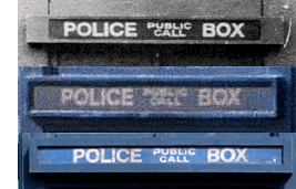 The second Yardley Jones fibreglass prop also had thick borders on the signboxes. The difference is shown on the right with the old Newbery sign (top) and the first and second of the new boxes (middle and below). The second Yardley Jones fibreglass prop also had thick borders on the signboxes. The difference is shown on the right with the old Newbery sign (top) and the first and second of the new boxes (middle and below).
 The second box had darker, slightly greyish colour. The second box had darker, slightly greyish colour.
Towards the end season twenty-one a third version this fibreglass design was created from the original moulds. Initially, the V3 box could be distinguished by the signage returning to the correct 'Officers and cars respond to urgent calls.'
The proper word "urgent" made its final appearance on the door-sign at the end of Trial of a Time Lord and throughout the Sylvester McCoy era the plaque carried the incorrect "all calls" phrase.
The Second and third boxes were used in tandem throughout the final years of the show.
Version 4 - The TV Movie - Hudolin
For the Paul McGann TV Movie, a new prop was commissioned by Philip Segal to more closely match the William Hartnell TARDIS. The 1980s fibreglass plans were used as a staring point but some modifications were made so that the columns were more pronounced and the panels set further back, taking away that "flat" feel that the 80s version had. It had an original fresnel navigation lamp complete with brass rims, and a special yale/ankh combination keyhole.
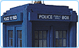
Version 5 - The New Series - Colin Richmond
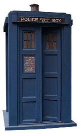
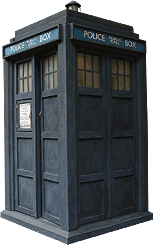
For the resurrection of the series in 2005 a new TARDIS shell was created. To be more specific, four were created at first. This prop was designed by one of Ed Thomas's Art Department team: a desiner called Colin Richmond. His interpretation was considerably wider and taller than any box that had gone before. For example, the doors of the new prop are 6'10" high, whereas the original prop's door were only 6'6".
These inaccuraces in the dimensions were actually a deliberate design choice, and Ed Thomas himself recited that old myth that 'Metropolitan Police Boxes came in various shapes and sizes.' As you might know if you've read the history of the real Police Box, this in fact this was never the case, and the Metropolitan 'TARDIS' Police Box was a specific Type 2 MacKenzie-Trench design, for which there was only design. These 'TARDIS' type Police Boxes were also always built from pre-cast concrete (the material is even specified in the original blueprints), so it's therefore strange to know that Ed Thomas 'went to great pains to make sure it looked wooden' . The only wooden component of the Police Box was the door (made of teak) and the only fully-wooden Boxes were scattered around the country looking like garden sheds and were not the familiar Metropolitan Design. It is a shame that this misinformation is so often used to give justification to the strange distortions performed on this supposedly perfect disguise for a time machine.
The windows of the 2005 of the were lit around the frames to try to create the illusion that it was bright on the inside, but this looked odd when the patches of illumination stuck to the window when the door opened, plus the new back-lit photographic blowup of the console room was never bright enough to explain the amount of light in the windows.
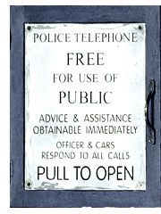 The plaque on the telephone door panel was black lettering on a white (actually metallic silver) background, not seen since the first sixties prop, however it still used the ugly ampersands, and had the "s" missing from "officer", and it also had the incorrect "all calls" wording first seen in Castrovalva. This error came about because this plaque was copied off a replica which had itself been copied from the incorrect eighties version. The plaque on the telephone door panel was black lettering on a white (actually metallic silver) background, not seen since the first sixties prop, however it still used the ugly ampersands, and had the "s" missing from "officer", and it also had the incorrect "all calls" wording first seen in Castrovalva. This error came about because this plaque was copied off a replica which had itself been copied from the incorrect eighties version.
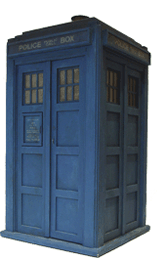
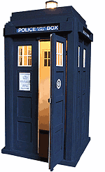
Due to the weight of the props and the damage caused to them, a new fifth prop was made out of fibreglass which featured from The Christmas Invasion onwards and the incorrect plaque was continued for the following series.
Version 5a - Matt Smith
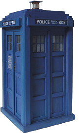
A new prop was constructed for the 2010 series of Doctor Who, in almost exactly the same dimensions as the 2005 box. In accordance with Steven Moffat's wishes, the new box was given a repaint in the style of the Peter Cushing prop which made it look closer to a real Police Box, despite still retaining its 'shot and fat' stature. The St John Ambulance logo returned to the prop for the first time in 45 years and the window frames were once again white with the bottom corner panes made to mimick the hammered glass of the real boxes. A very authentic-looking fresnel lantern also adorned the top of this box.
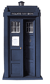
 The Peter Cushing TARDIS The Peter Cushing TARDIS
For the two 1960s Peter Cushing film versions of Doctor Who in which a human creates his own time machine, a very faithful reproduction of a Police Box was built.
The main difference between the TV prop and the film version was that the doors opened outwards. The doors and interior of the prop were shown to be painted white.
|