My
Artwork for the 2006 Doctor Who Series 2 BBC DVD Releases -
Part I
In
February 2006 I was approached by the design company responsible for the Series
2 DVD release of Doctor Who, and asked if I could provide a 3D model of a TARDIS
for the back cover. I did have a police box already created but it was an old-series
style box which has design differences to the new series model so I decided to
start from scratch. I
knew that depending on its use, a wrongly-styled Police Box was the kind of thing
that could potentially irritate fans and this was artwork that was going to be
immortalised on the DVD sleeves. These sleeves were for what have previously been
referred to as the "Vanilla" releases that were the single-disc versions
put on sale relatively soon after the episodes had been screened (as opposed to
the end-of-year boxed set that also included extras).
The
idea of the "vanilla" sleeves series was to retain the same basic template
for each disc of the season but to tint the colour differently for each release
and also include a different TARDIS image.
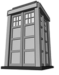
The proportions of the new series
Police Box are more cube-shaped than the classic series box. After making a rough
untextured model very quickly (far top left), this was then refined once the deadline
for the first disc's release was extended and I was able to work harder on making
it more accurate. Although the ultimate size of the TARDIS on the sleeve was to
be quite small, it was worth putting the effort in to making it as a accurate
as possible as it's a useful model to have stored away for future use.
Above
is the final render as used on disk for The Christmas Invasion and New
Earth with an increased angle of perspective in order to give it a more dynamic
feel and my suggested burst of light behind the TARDIS replacing the time vortex
cloud that had been on earlier versions.
My next task was to create a TARDIS
wall-shape which was to become a repeating pattern for the inside sleeve (they
were generally referred to as roundels in the past, but in the new series they
are hexagonal, so a new name is required!). Again
it was only to be small when printed but attention to detail now would give me
a good quality model for the future. The wall-shape was based on a close-up photo
of a panel on display at the then Brighton Doctor Who Exhibition with amends made
based on set photos as the finish was slightly different. Although
the TARDIS wall is normally an organic brown colour as seen in the flat-on render
above right, the model was re-lit using a variety of colours for each DVD, initially
green being disc one as shown left.
Unfortunately, my largest contribution
to the sleeve in terms of size, was actually the least interesting feature. Using
the cracked texture that features on the ring of the roundel, I also added the
scratched wall texture to create a bevelled hexagon onto which the synopsis text
was laid for the episodes on the DVD.
Another
contribution to disc one was the Guinevere space probe from The Christmas Invasion.
This was as again modelled as accurately as possible from TV reference stills.
One deliberate mistake was to move the Union Flag from the back radar
disk onto the front dish as the-powers-that-be were keen to push the British identity
forward, just as it was a feature of the TV story.
Some
modelling work of mine which was ultimately unused was to create a backdrop of
circuitry and wires to act as a frame for the front cover. The exact nature of
this imagery was something of a secret but strangely, now the series has been
broadcast, the highly classified screen grabs which I was sent for reference did
not match anything that was seen on screen.
In
the end my version was probably too dark and too overwhelming. The style guide
for the new series is very much about colour, energy and excitement whereas this
mass of wires was probably just not hitting the mark. Either that, or the plot
strand relating to those mysterious wires was cut out, making the DVD style irrelevant.
The
final design for this video cover is overflowing with energy and hats off to Stuart
at the design company for marrying together all the elements that were brought
together. Design by committee can be a bit of a minefield but I think the final
cover works a treat. The image on the right shows the finished product and link
to buy.
Keep
this website out of direct sunlight. This website may contain nuts. Your nuts
are at risk if you do not keep up repayments.
 In
February 2006 I was approached by the design company responsible for the Series
2 DVD release of Doctor Who, and asked if I could provide a 3D model of a TARDIS
for the back cover. I did have a police box already created but it was an old-series
style box which has design differences to the new series model so I decided to
start from scratch.
In
February 2006 I was approached by the design company responsible for the Series
2 DVD release of Doctor Who, and asked if I could provide a 3D model of a TARDIS
for the back cover. I did have a police box already created but it was an old-series
style box which has design differences to the new series model so I decided to
start from scratch. 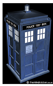 I
knew that depending on its use, a wrongly-styled Police Box was the kind of thing
that could potentially irritate fans and this was artwork that was going to be
immortalised on the DVD sleeves. These sleeves were for what have previously been
referred to as the "Vanilla" releases that were the single-disc versions
put on sale relatively soon after the episodes had been screened (as opposed to
the end-of-year boxed set that also included extras).
I
knew that depending on its use, a wrongly-styled Police Box was the kind of thing
that could potentially irritate fans and this was artwork that was going to be
immortalised on the DVD sleeves. These sleeves were for what have previously been
referred to as the "Vanilla" releases that were the single-disc versions
put on sale relatively soon after the episodes had been screened (as opposed to
the end-of-year boxed set that also included extras). 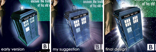
 New
Earth with an increased angle of perspective in order to give it a more dynamic
feel and my suggested burst of light behind the TARDIS replacing the time vortex
cloud that had been on earlier versions.
New
Earth with an increased angle of perspective in order to give it a more dynamic
feel and my suggested burst of light behind the TARDIS replacing the time vortex
cloud that had been on earlier versions. Again
it was only to be small when printed but attention to detail now would give me
a good quality model for the future. The wall-shape was based on a close-up photo
of a panel on display at the then Brighton Doctor Who Exhibition with amends made
based on set photos as the finish was slightly different.
Again
it was only to be small when printed but attention to detail now would give me
a good quality model for the future. The wall-shape was based on a close-up photo
of a panel on display at the then Brighton Doctor Who Exhibition with amends made
based on set photos as the finish was slightly different. 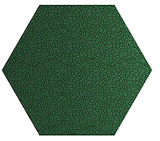 Although
the TARDIS wall is normally an organic brown colour as seen in the flat-on render
above right, the model was re-lit using a variety of colours for each DVD, initially
green being disc one as shown left.
Although
the TARDIS wall is normally an organic brown colour as seen in the flat-on render
above right, the model was re-lit using a variety of colours for each DVD, initially
green being disc one as shown left. Another
contribution to disc one was the Guinevere space probe from The Christmas Invasion.
Another
contribution to disc one was the Guinevere space probe from The Christmas Invasion.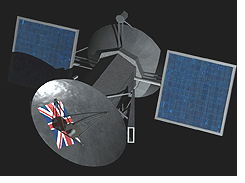 This was as again modelled as accurately as possible from TV reference stills.
 Some
modelling work of mine which was ultimately unused was to create a backdrop of
circuitry and wires to act as a frame for the front cover. The exact nature of
this imagery was something of a secret but strangely, now the series has been
broadcast, the highly classified screen grabs which I was sent for reference did
not match anything that was seen on screen.
Some
modelling work of mine which was ultimately unused was to create a backdrop of
circuitry and wires to act as a frame for the front cover. The exact nature of
this imagery was something of a secret but strangely, now the series has been
broadcast, the highly classified screen grabs which I was sent for reference did
not match anything that was seen on screen.